
How to Reduce Bounce Rate on Website: Master Website Bounce

Most bounce rate advice starts with the wrong target. It tells you to lower the sitewide number, as if every visit has the same value and every bounce means failure.
That’s not how experienced SEO teams work.
If someone lands on a quick-answer page, gets what they need, and leaves, that may be fine. If a low-quality referral source sends untargeted visitors who leave fast, that may not deserve your attention either. However, a significant issue is when high-intent traffic lands on pages that should convert or at least pull people deeper into the site, and those visitors leave because the experience breaks down.
When people ask me how to reduce bounce rate on website pages, I don’t start with a homepage redesign or a list of generic UX tips. I start with segmentation. I want to know which traffic sources matter, which landing pages carry commercial intent, which devices underperform, and where the disconnect starts. Then I fix the leaks in order.
That approach saves time, protects budget, and usually produces cleaner gains than broad sitewide changes.
Why Your Approach to Bounce Rate Is Wrong
The common mistake is treating bounce rate like a single health score. It isn’t.
A blended bounce rate hides the only thing that matters: who bounced, from where, and on what page. A high bounce rate from low-commitment traffic can be normal. A moderate bounce rate from your most valuable organic landing pages can be a revenue problem.
Sitewide averages hide priority
When teams obsess over one dashboard number, they often optimize the wrong pages. They rewrite blog posts that were never meant to drive sales. They overreact to social or referral traffic that was unlikely to convert. They add cluttered CTAs everywhere just to force another click.
That usually makes the site worse.
Nielsen Norman Group’s guidance on reducing bounce rates highlights the point that some low-value referrers naturally produce very high bounce rates, while redesign work on committed traffic sources can drastically improve outcomes. That distinction is the difference between amateur reporting and useful diagnosis.
Practical rule: Judge bounce rate in context. Source, page type, device, and intent matter more than the sitewide average.
High-value traffic deserves the first fix
Organic search traffic to money pages deserves scrutiny first. That traffic often arrives with a clear problem, a comparison in mind, or purchase intent. If those visitors bounce, something is off in the handoff between the search result and the page.
In practice, I look at:
- Organic landings on service or product pages because those visitors usually have stronger intent
- Branded versus non-branded search because expectations differ
- Referral sources with clear commercial relevance instead of lumping all referrals together
- Mobile traffic to key landing pages because friction shows up there fast
A bounce from casual social traffic is not equal to a bounce from a buyer searching for your category.
Some bounces are noise. Some are expensive.
A blog post answering one narrow question may naturally produce single-page sessions. A pricing page, product page, category page, or lead-gen landing page shouldn’t.
That’s why “reduce bounce rate everywhere” is weak advice. It creates busywork. A better question is this: Where are qualified visitors leaving before they take the next meaningful step?
Once you ask that, your priorities get clearer. You stop chasing vanity improvements and start fixing commercial friction.
Your Diagnostic Framework for Finding Real Problems
A useful bounce rate audit starts in analytics, but it shouldn’t end there. Numbers tell you where the problem lives. Behavior tools tell you why.
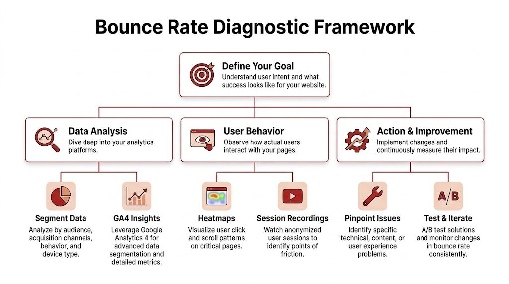
Start with segments, not summaries
In GA4, don’t begin with the overall traffic report. Go to landing page performance and break it down by the dimensions that influence bounce behavior.
Use a first pass like this:
- Traffic source and medium. Separate organic, direct, referral, paid, and social.
- Landing page. Find which pages are receiving entrances and losing people quickly.
- Device category. Split desktop and mobile before drawing conclusions.
- Geography. If you serve multiple markets, location can expose relevance issues.
Through such analysis, many teams find the true picture. One page may look acceptable overall, but the mobile organic segment might be underperforming badly while desktop direct traffic looks fine.
Build a practical review grid
I prefer to export the data into a simple working sheet. That forces prioritization.
| Segment | What to check | What it usually means |
|---|---|---|
| Organic to money pages | Bounce trend, conversions, engagement | Intent mismatch or weak next step |
| Referral traffic | Source quality, landing page fit | Untargeted visitors or bad campaign placement |
| Mobile landings | Exit patterns, page speed, layout | Friction, instability, or poor tap targets |
| Geo-specific traffic | Language, currency, message fit | Relevance problem, not always UX |
If you suspect the traffic itself is distorted, review how non-human or low-quality sessions can muddy your reporting. This breakdown of fake web traffic patterns is useful when analytics numbers look strange but on-page behavior doesn’t match.
The worst bounce-rate decisions usually come from mixed segments. Clean the data first, then diagnose the page.
Pair GA4 with behavior evidence
Analytics tells you where the exits happen. Heatmaps and session recordings help you see friction that metrics can’t explain on their own.
Look for patterns such as:
- Users stop before the first meaningful content block
- They rage-click on non-clickable elements
- They try to use filters or menus that feel unclear
- They never reach the CTA because the page front-loads fluff
Outside UX resources can help sharpen your review. Divi Mode, for example, has a solid set of proven tips to keep visitors engaged that line up well with what shows up in heatmaps and recordings.
Diagnose by intent, not just by page
A service page and an informational blog post shouldn’t be judged by the same standard. Ask what the visitor likely wanted when they arrived.
Use three quick diagnostic questions:
- Did the page match the promise made in search, email, ad, or referral link?
- Could the visitor understand the value in a few seconds?
- Was the next action obvious without extra effort?
If the answer is no to any of those, you have a bounce problem worth fixing.
Secure the First 5 Seconds with Foundational Fixes
Bounce rate problems often get blamed on content too early. On many pages, the visitor leaves before the content even has a fair chance.
That first loss usually happens in the first few seconds, and it shows up fastest on high-intent landing pages from organic search, branded queries, and other targeted traffic sources that bring visitors with a clear goal. If those users hit delay, layout shift, or a clumsy mobile experience, the session is over before trust forms.
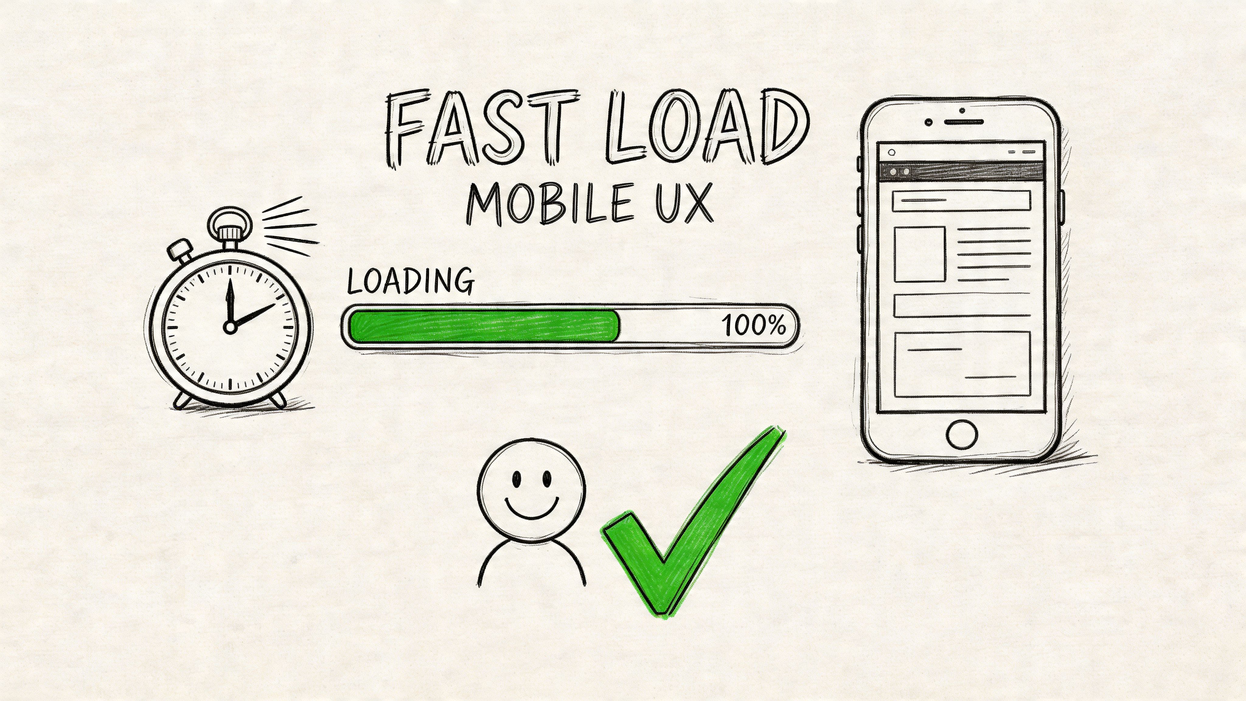
Treat Core Web Vitals as a triage system
WP Rocket’s guidance on bounce rate reduction highlights three page experience thresholds that matter in practice: LCP under 2.5 seconds, FID under 100ms, and CLS under 0.1. That same source notes that slower load times correlate with higher bounce rates, while stronger Core Web Vitals performance often improves engagement.
The practical translation is simple:
- LCP measures whether the main content appears quickly
- FID measures whether the page responds fast when someone tries to use it
- CLS measures whether the layout shifts while loading
I treat these as triage, not vanity metrics. If a service page ranks well but organic visitors bounce before scrolling, I check whether the page is slow, unresponsive, or unstable before rewriting a single headline.
Fix the elements that create early friction
Some technical issues matter far more than others. Start with the ones users feel immediately:
- Oversized images. Compress them, convert where appropriate to WebP, and stop loading massive hero assets that add weight without adding clarity.
- Render-blocking scripts. Delay non-essential JavaScript so visible content appears first.
- Bloated CSS and JavaScript. Minify files, remove unused code, and cut overlapping plugins.
- Missing caching. Enable browser caching so repeat visits do not reload everything from scratch.
- No CDN for broad audiences. Use a content delivery network if traffic comes from multiple regions.
- Bad lazy loading. Lazy load supporting media below the fold, not the headline, hero image, or primary value proposition.
Google PageSpeed Insights is useful for one reason. It helps identify the exact assets slowing the page down. The score matters less than the bottlenecks.
Mobile is where weak pages get exposed
Mobile traffic is less forgiving. Smaller screens, slower connections, and thumb-based navigation make friction obvious.
As noted earlier from the WP Rocket research, poor mobile experiences push bounce rates up fast. I see the same pattern in audits. A page that feels acceptable on desktop can fail badly on a phone because the first screen gets crowded, delayed, or hard to use.
Test on an actual device and check:
- Button size and spacing
- Font size and line length
- Sticky headers that consume too much screen space
- Popups that block the content
- Forms that are tedious to complete
- Carousels or tabs that break on touch
Ask a stricter question than “is it responsive?” Ask whether a distracted user can understand the page and take the next step with one thumb.
Choose speed and clarity over visual excess
Teams often make the wrong trade-off. Stakeholders approve motion effects, oversized media, and layered scripts because they look polished in a review environment. Real visitors experience them as delay and friction.
| Usually helps | Often hurts |
|---|---|
| Static hero with clear copy | Video hero that delays the main content |
| Compressed WebP images | Decorative oversized imagery |
| Delayed non-essential scripts | Multiple third-party trackers firing on load |
| Stable layout with reserved image space | Elements shifting as ads, banners, or embeds appear |
| Simple mobile navigation | Crowded headers and stacked popups |
Lower bounce rates usually come from restraint. Fast pages feel easier to trust, especially for organic visitors who arrived with a specific intent and limited patience.
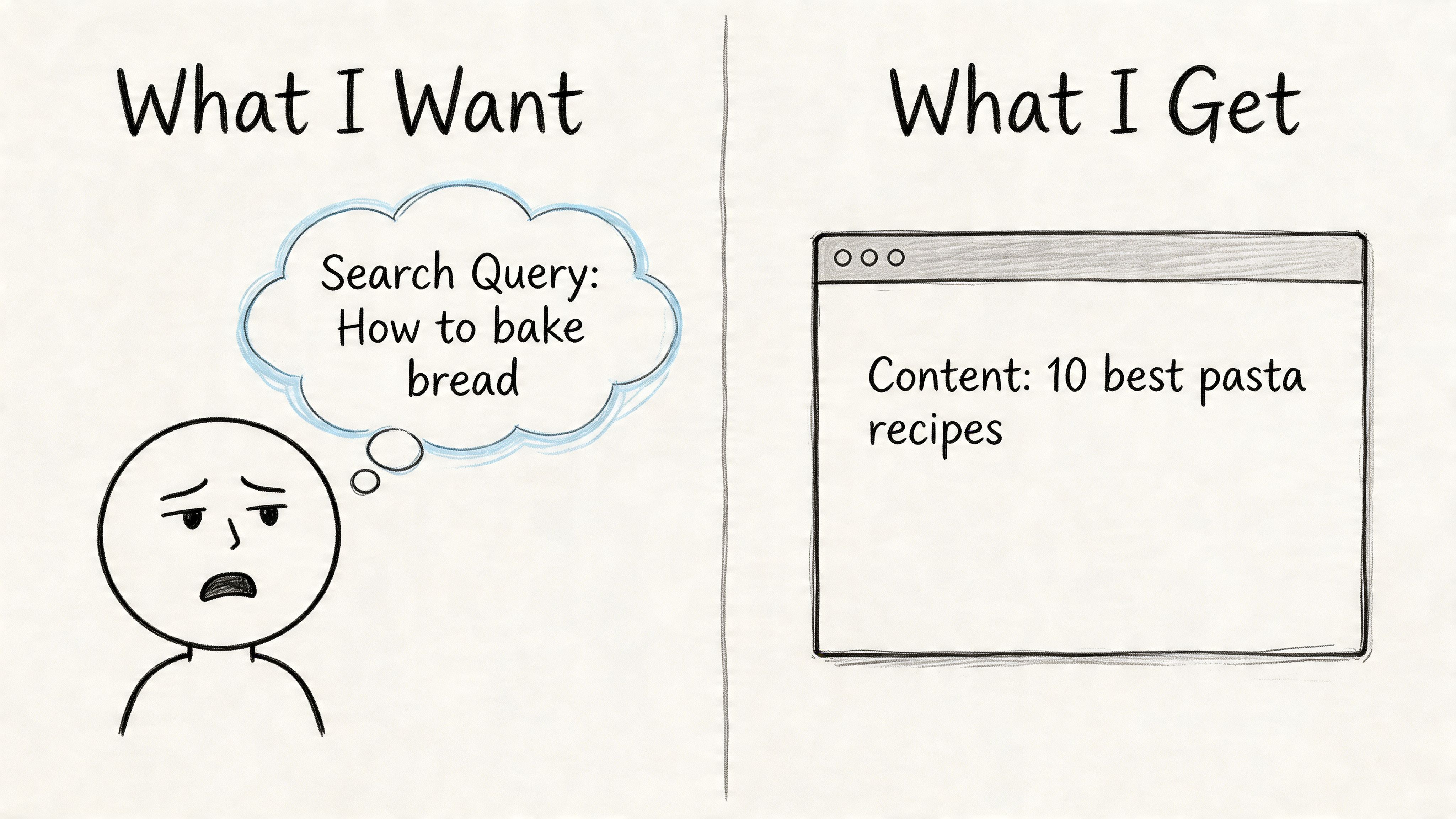
Align Your Content with Searcher Intent
Bounce rate often gets treated like a page problem. For organic traffic, it is usually an intent problem first.
A page can be fast, readable, and technically clean, then still lose search visitors because it answers a different question than the one they had in mind. That is why I do not review this section of an article in isolation. I segment bounce rate by source and intent. If organic sessions bounce on a high-impression query set, that deserves attention before a low-value social page with noisy traffic.
Express Writers notes that bounce rates vary by industry, from 27.92% in clothing to 48.22% in IT. That range matters because it keeps teams from chasing a generic benchmark when the key question is whether the page is satisfying your target traffic.
Read the SERP before you rewrite the page
Search the query manually and study what already ranks. Google usually makes the intent pattern obvious.
Look for three things:
- Page type in the top results. Are they guides, service pages, category pages, product pages, or tools?
- Promise in the title tag. Are ranking pages focused on comparisons, pricing, definitions, templates, or step-by-step help?
- Content structure near the top. Do they answer quickly, show examples, lead with product details, or push the user into a decision?
This step prevents a common mistake. Teams rewrite copy without checking whether the page format itself is wrong. If the SERP is dominated by comparison content and you publish a generic service page, better wording will not solve the mismatch.
Match the promise from snippet to page
Bounce often starts before the page loads. It starts in the search result.
If the title promises a guide, the page needs to teach fast. If the meta description hints at pricing, the visitor expects pricing context early. If the query suggests commercial investigation, a broad educational intro is the wrong lead.
Use this standard:
| Weak match | Better match |
|---|---|
| Title promises a guide, page opens with brand fluff | Title and intro both state the exact method or answer |
| Description implies pricing help, page hides pricing discussion | Description sets the right expectation and the page addresses it early |
| Keyword suggests comparison, page gives a definition only | Page includes comparison criteria and next-step guidance |
I tell clients this bluntly. If the snippet sells one outcome and the page delivers another, the bounce is justified.
Traffic quality matters here too. Pages built for broad reach often attract the wrong clicks and inflate bounce rate without hurting anything important. Pages attracting qualified searchers are different. If you want a better mix of visitors before they even land, this guide to targeted traffic from search and intent-aligned channels is useful.
Make the answer visible early
Search visitors scan for confirmation. They want to know, within seconds, whether they landed in the right place.
That means the page should surface the answer early:
- A headline that mirrors the query closely
- An opening that addresses the primary question without delay
- Subheadings that show the path of the argument
- Specific language instead of broad claims or scene-setting
- Examples, screenshots, or proof when the topic is practical
The same source also notes that 20% of initial exits come from poor navigation. In practice, I see that overlap with intent mismatch all the time. Users leave because the content does not answer fast enough, or because the page structure makes the answer hard to find.
A short video walkthrough can also help teams think more clearly about content alignment and user expectations:
Scannability matters more than word count
Longer content does not automatically reduce bounce rate. Clearer content does.
For high-intent organic queries, the winning page is often the one that gives the visitor a fast orientation, then lets them go deeper if they choose. A 900-word page with a direct answer, clean subheads, and useful examples will often hold attention better than a 2,500-word article that delays the point.
Use formatting that helps scanning:
- Short paragraphs
- Descriptive H2s and H3s
- Bullets for comparisons, steps, or criteria
- Visuals that clarify a process
- Internal references that continue the user’s task, not distract from it
This is the trade-off. Writing for completeness can hurt engagement if completeness buries the answer. Writing for clarity gets the visitor oriented first, which is usually what reduces bounces from organic search.
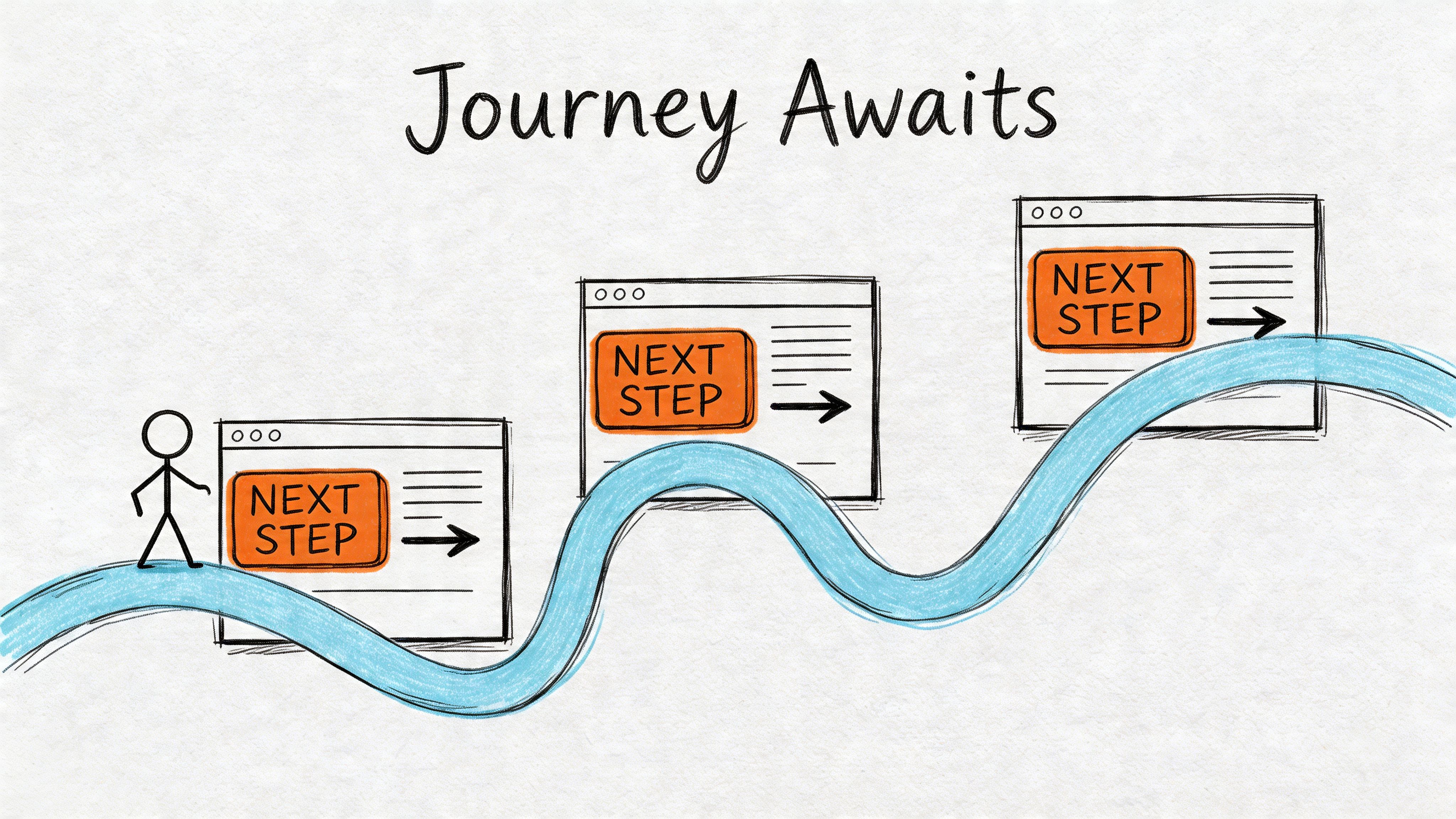
Guide the User Journey with Smart Navigation and CTAs
Bounce rate often gets treated like a page problem. On client sites, it is usually a path problem.
A visitor from branded search behaves differently from a visitor landing on an informational blog post. Organic traffic with clear intent deserves the most attention first, because that is where better engagement can support rankings, lead quality, and revenue at the same time. If a high-value landing page answers the query but gives the visitor nowhere sensible to go next, the session still dies early.
Navigation should remove hesitation
Visitors leave when the next step is unclear. That usually shows up as vague menu labels, oversized dropdowns, weak in-content links, or CTAs that ask for too much too soon.
Semrush’s bounce rate guidance is useful here. It recommends contextual internal links and intent-timed CTAs, notes that aligned intent can cut bounces by 15% to 25%, and says vague anchors like “click here” reduce efficacy by 40%.
That lines up with what I see in audits. Pages with decent traffic often underperform because the visitor has to stop and interpret the interface. Every extra decision creates friction.
Internal links should answer the next question
Good internal linking continues momentum. It should feel like the next logical move for that traffic segment, not a generic invitation to browse.
On a service page, compare these choices:
- Weak link: Click here
- Better link: Compare our SEO audit process
- Weak link: Learn more
- Better link: See what’s included in monthly optimization
The stronger version reduces ambiguity. It also improves the odds that the visitor keeps reading instead of returning to search results.
This matters even more on organic landing pages. If the user arrives with early-stage intent, a well-placed link to a related explainer, case study, or comparison page can increase session depth and improve dwell time on your website without forcing a hard conversion.
Match the CTA to the visitor’s intent
A common mistake is treating every session like a sales-ready session.
Someone who searched “how to reduce bounce rate on website” is rarely ready for “Book a demo” as the first ask. A better CTA respects where they are in the decision process.
| Visitor stage | Weak CTA | Better CTA |
|---|---|---|
| Early research | Contact us | Read the full guide |
| Comparison mode | Get started | Compare plans or services |
| High intent | Learn more | Request pricing or book a call |
This is one of the clearest trade-offs in CRO work. Aggressive CTAs can increase clicks from a small subset of ready buyers, but they often depress engagement from everyone else. On SEO landing pages, softer next steps usually win first.
Improve page pathways, not just buttons
Top navigation is only one part of the journey. Users also rely on breadcrumbs, inline links, filters, related resources, sticky summaries, and page sections that help them move without re-orienting.
Practical fixes include:
- Breadcrumbs on deeper pages
- Sidebar or in-content links to closely related topics
- Related resource blocks matched to the page’s intent
- Product or search filters on large category pages
- Section jump links on long-form content with mixed intent
For SaaS and e-commerce sites, the same source noted earlier says advanced search filters can reduce bounces. That makes sense in practice. If users can narrow choices fast, they stay in the session instead of restarting their search on another site.
Measure CTA engagement like a behavior signal
A low click-through rate on internal links usually points to one of three problems. The link is too generic, the placement is wrong, or the CTA does not match intent.
Track those interactions properly. Google Analytics Event Tracking helps you measure internal link clicks, CTA taps, accordion opens, and other actions that show whether users are moving through the page the way you intended.
That gives you a cleaner read on whether the issue is content quality or path design.
What usually fails
These patterns look busy and “optimized” in a mockup, but they often increase exits:
- Too many top-level menu items
- Multiple CTAs competing above the fold
- “Read more” links with no context
- Related posts that do not match the page’s intent
- Sticky elements that cover content or distract from the main task
Good navigation feels calm. It gives each traffic source a clear next step, reduces decision fatigue, and turns a single-page visit into forward motion.
Advanced Tactics for Testing and Tracking Engagement
Once the obvious friction is fixed, bounce rate improvement becomes a measurement problem as much as a UX problem.
You need better tracking, cleaner hypotheses, and a disciplined testing loop.
Redefine what counts as engagement
Some sessions look like bounces even when the visitor found value. That’s why event tracking matters.
If someone scrolls extensively, watches a video, opens an accordion, downloads a guide, or interacts with a calculator, that tells you more than a single pageview can. A practical walkthrough of Google Analytics Event Tracking helps if your setup is still pageview-heavy.
Meaningful engagement events usually include:
- Scroll depth milestones
- Video plays
- File downloads
- Clicks on comparison tabs or FAQs
- Form starts and completions
That doesn’t mean you should manufacture events just to make bounce rate look better. It means you should measure genuine engagement so the metric reflects reality.
Test the first impression first
Clutch reports that 83% of shoppers judge a website’s credibility in under 20 seconds, 80% of consumers leave a site they don’t like, and 84% say website design influences their shopping decision. The same source says that adding trust signals like SSL badges, contact details, return policies, and reviews near key decision points helped some sites reduce bounce rates by 20% to 30% in 30 days.
That makes trust elements one of the easiest A/B testing priorities.
Start with tests such as:
- Headline clarity versus cleverness
- Trust badges near forms or checkout versus hidden in the footer
- Visible contact information versus no reassurance
- Shorter intro with direct value versus long brand-led opening
- Primary CTA wording based on intent stage
When a page underperforms, test what users see first. Small trust and clarity changes often beat large redesign ideas.
Use a simple testing workflow
A/B testing is often overcomplicated. Keep it operational.
| Step | Good practice |
|---|---|
| Pick a page | Choose a page with valuable traffic, not random blog content |
| Form a hypothesis | Example: adding reviews near the CTA will improve trust |
| Change one main variable | Don’t rewrite the whole page at once |
| Watch supporting metrics | Conversions, engagement events, pathing, and bounce |
| Keep notes | Record what changed and what happened |
If a change lowers bounce but hurts conversion quality, it wasn’t a win. That trade-off matters.
Tie bounce work to downstream engagement
Bounce rate is rarely the end metric. It’s a symptom and an early signal. The bigger goal is stronger engagement and better progression through the site.
That’s why I like to review bounce fixes alongside scroll depth, assisted conversions, and page-path reports. If you want a strong companion metric, this article on how to increase dwell time on your website fits naturally with bounce analysis because it forces you to think beyond the first click.
The best testing programs don’t chase a lower number in isolation. They improve the session quality that number is trying to describe.
Turning Reduced Bounces into Sustainable Growth
Lower bounce rates are the byproduct of a better website. That’s the frame that keeps teams honest.
When you segment traffic properly, you stop wasting effort on low-value noise. When you fix speed and mobile usability, fewer visitors leave before the page has a chance. When you align copy with search intent, users feel they arrived in the right place. When navigation and CTAs guide the next step, more sessions turn into journeys instead of exits.
Treat bounce rate as an operating signal
Used well, bounce rate helps you spot friction early.
Used badly, it becomes a vanity metric that pushes teams toward shallow fixes like forced clicks, intrusive popups, or irrelevant link stuffing. Those tactics might change the number, but they rarely improve the business.
A more durable approach looks like this:
- Segment by source and intent
- Prioritize high-value landing pages
- Remove technical friction first
- Rewrite pages that break the expectation set in search
- Guide visitors toward the next meaningful action
- Test, measure, and keep refining
Better sessions create better outcomes
When a page keeps the right visitor engaged, other metrics usually improve with it. People view more pages. They spend longer evaluating the offer. They convert more often. They trust the brand faster.
That’s why learning how to reduce bounce rate on website pages isn’t a narrow CRO task. It sits at the intersection of SEO, UX, messaging, and analytics. Teams that understand that don’t just “fix bounce rate.” They build sites that are easier to trust and easier to use.
That’s what sustainable growth usually looks like in practice. Fewer wasted visits. More qualified engagement. Better decisions based on cleaner signals.
If you’ve already improved page speed, intent alignment, and on-page engagement, the next lever is getting more of the right people onto those pages. ClickSEO helps websites increase organic CTR and strengthen engagement signals by driving real search users to target pages, with control over keywords, locations, session depth, and dwell behavior. For SEO agencies, e-commerce brands, and growth teams that want qualified organic traffic to land on optimized pages, it’s a practical way to support the work you’ve already done on-site.